


Designing a festival poster and animation: Behind the scenes of a client project
Drawing Nature

Hey all,
Welcome to Drawing Nature, the companion newsletter to Human Nature where I talk about my illustration process.
If you’re enjoying this newsletter, please help it reach more people by liking, commenting, sharing and subscribing!
First of all, sorry this post is a day late. Although I don’t think anyone keeps track of these things, I do normally post on Tuesdays. Now that we’ve got that out of the way, let’s move on to today’s post.
This week I’d like to talk about something a little different than usual and take you behind the scenes of a client project I worked on recently. The process is quite different to that of making the newsletter illustrations, plus this project involved animation—so I thought it could be interesting!
Last month, I created a poster and an animation for Meadowlark music festival in Stone Ridge, New York. I already made an Instagram post about the process, but I thought I’d show you a little bit more here.

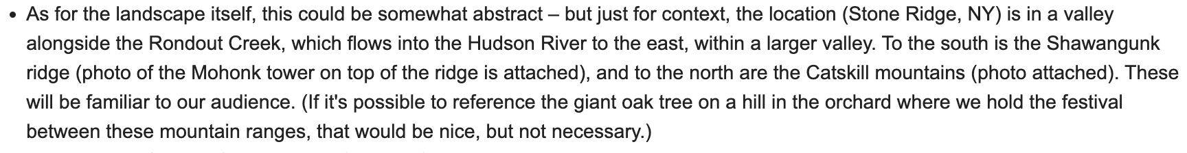
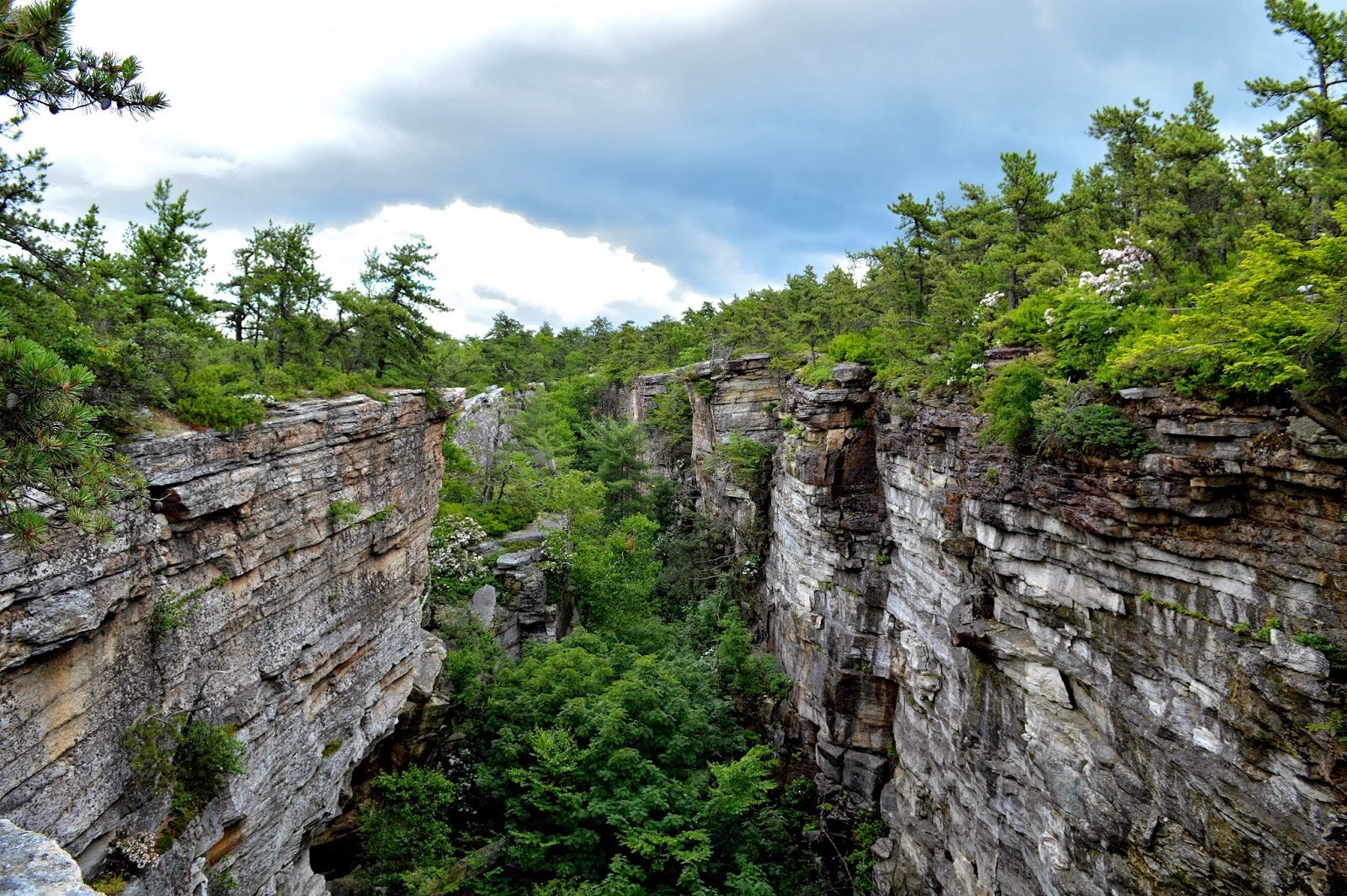
The brief was to create a design inspired by the venue—an apple orchard nestled between two mountain ridges—and a short animation to promote the festival on social media.
Initial concepts
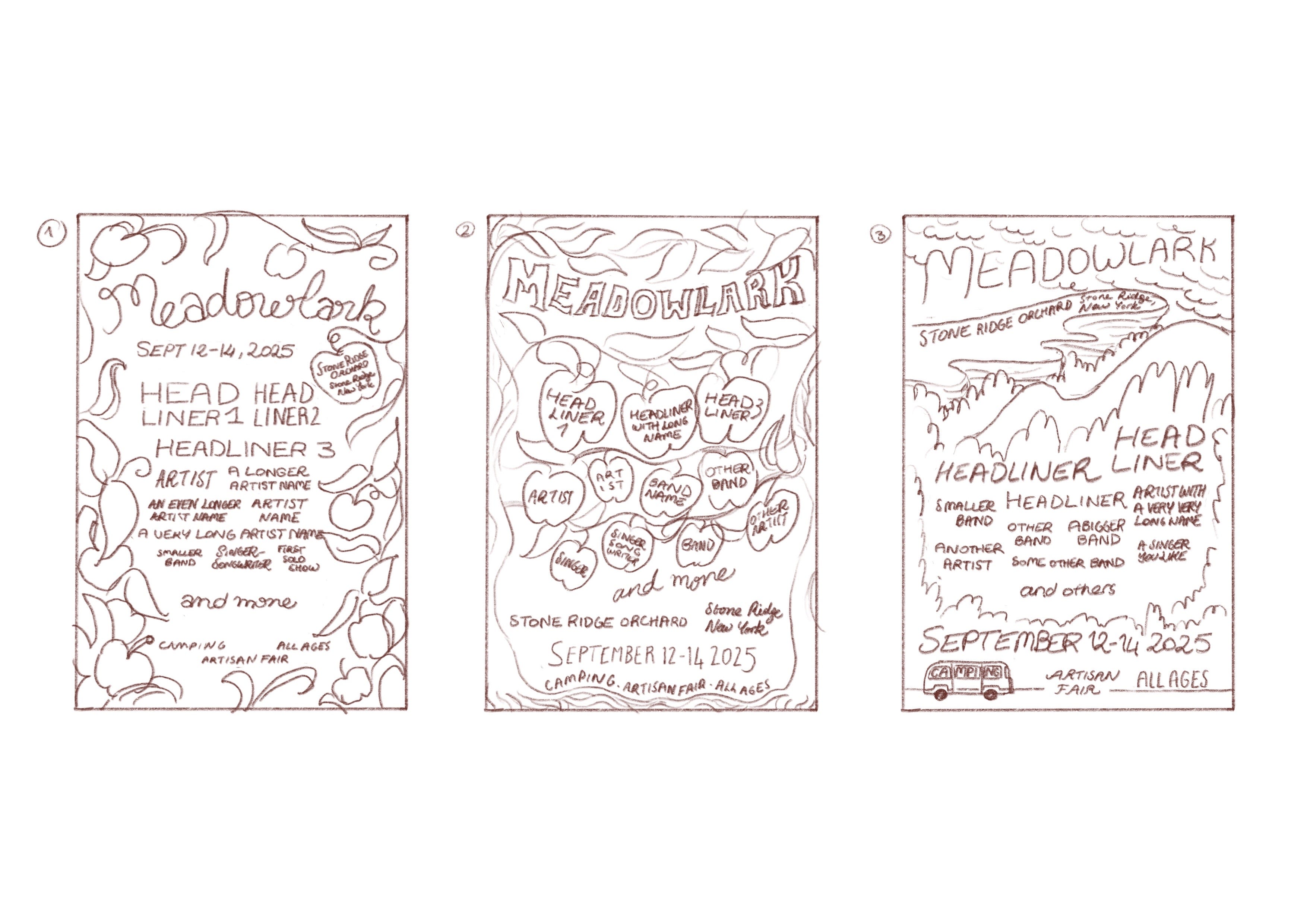
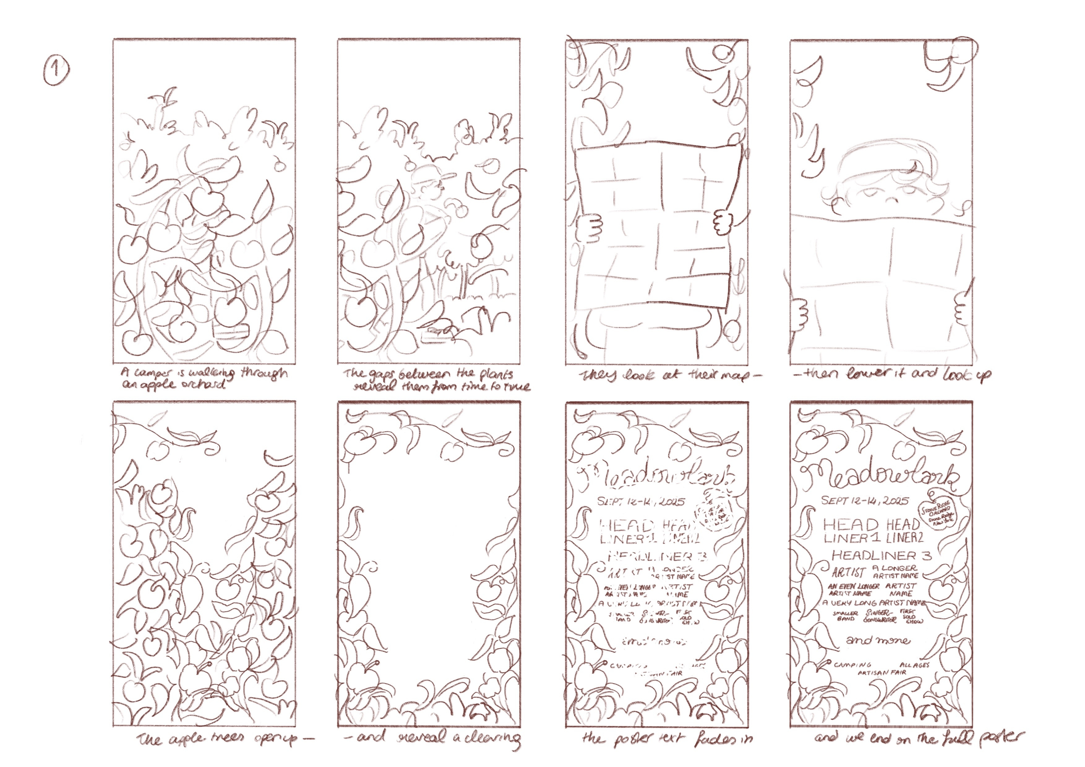
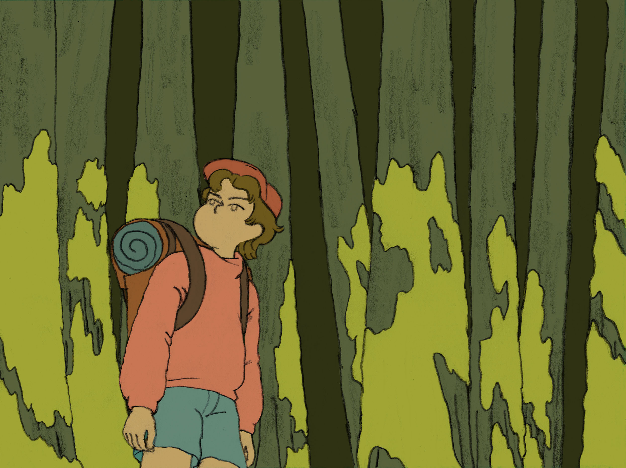
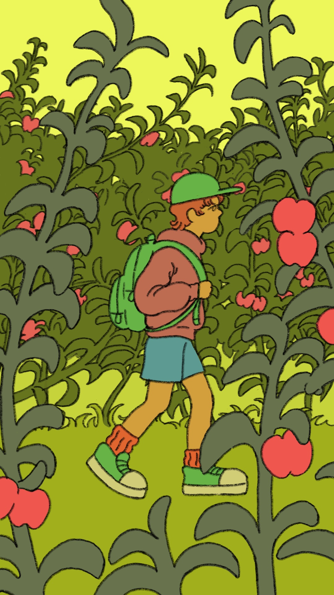
The organisers suggested a festival-goer walking through the apple orchard for the animation, so I proposed two poster designs with apples and one with a landscape:
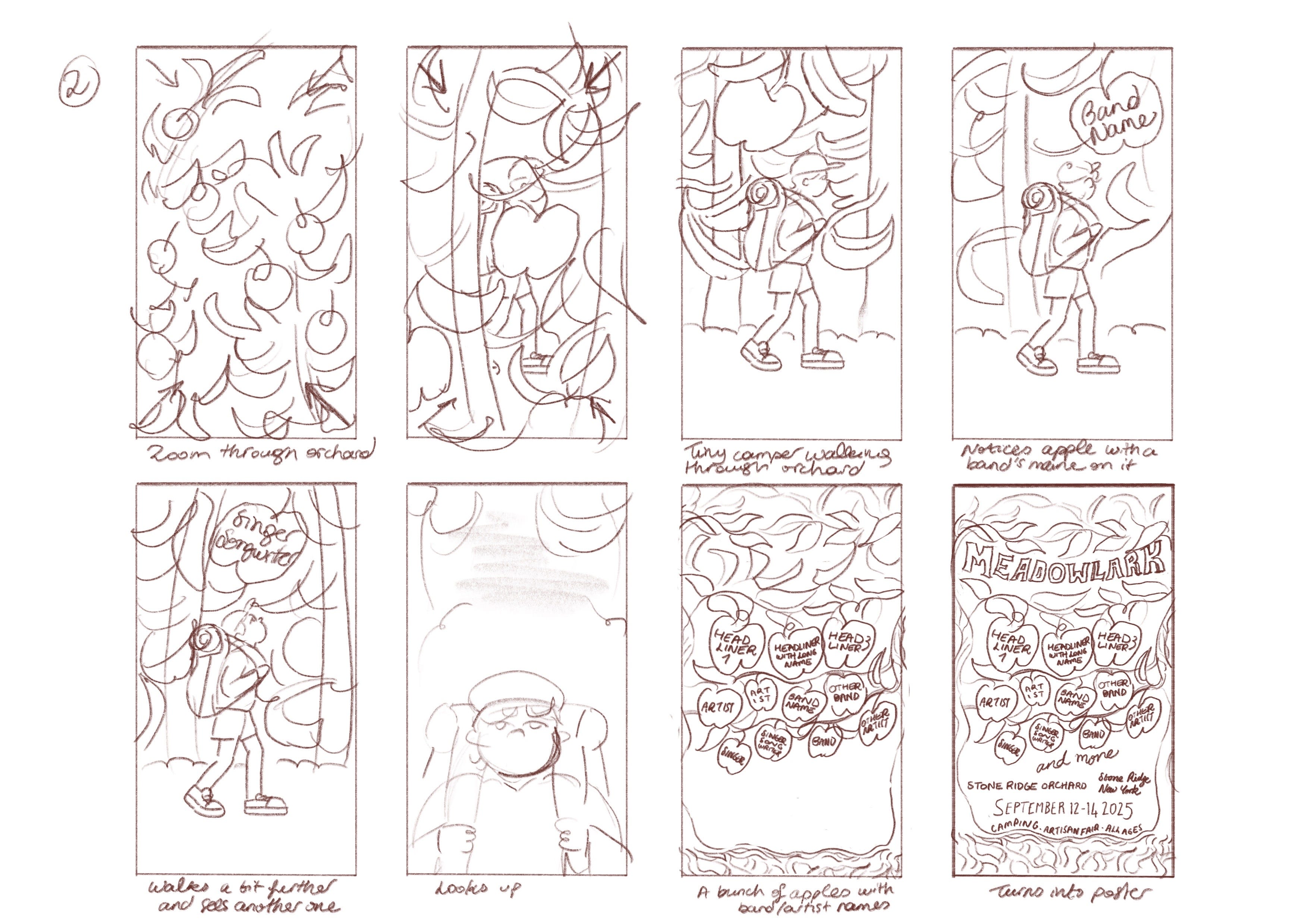
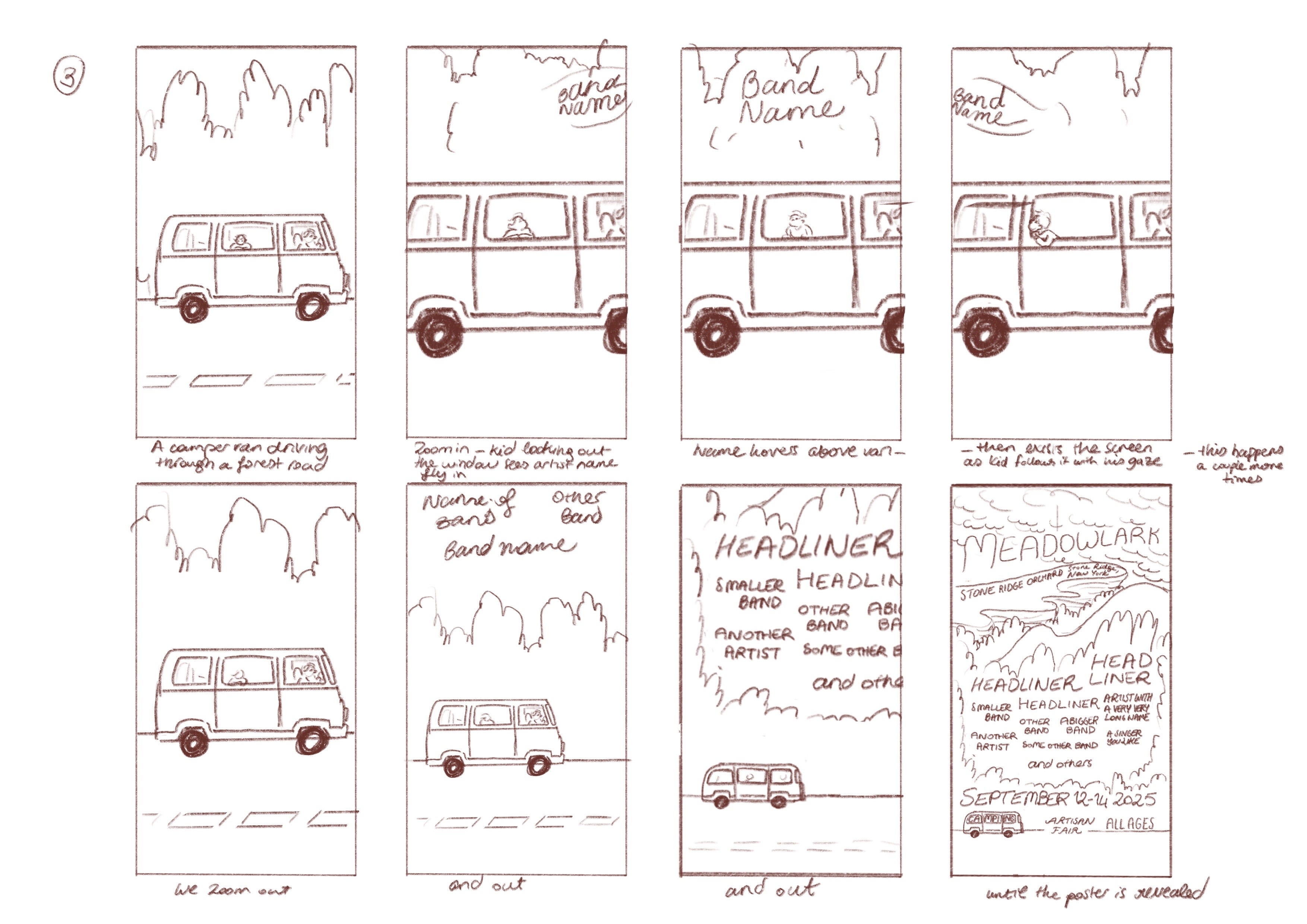
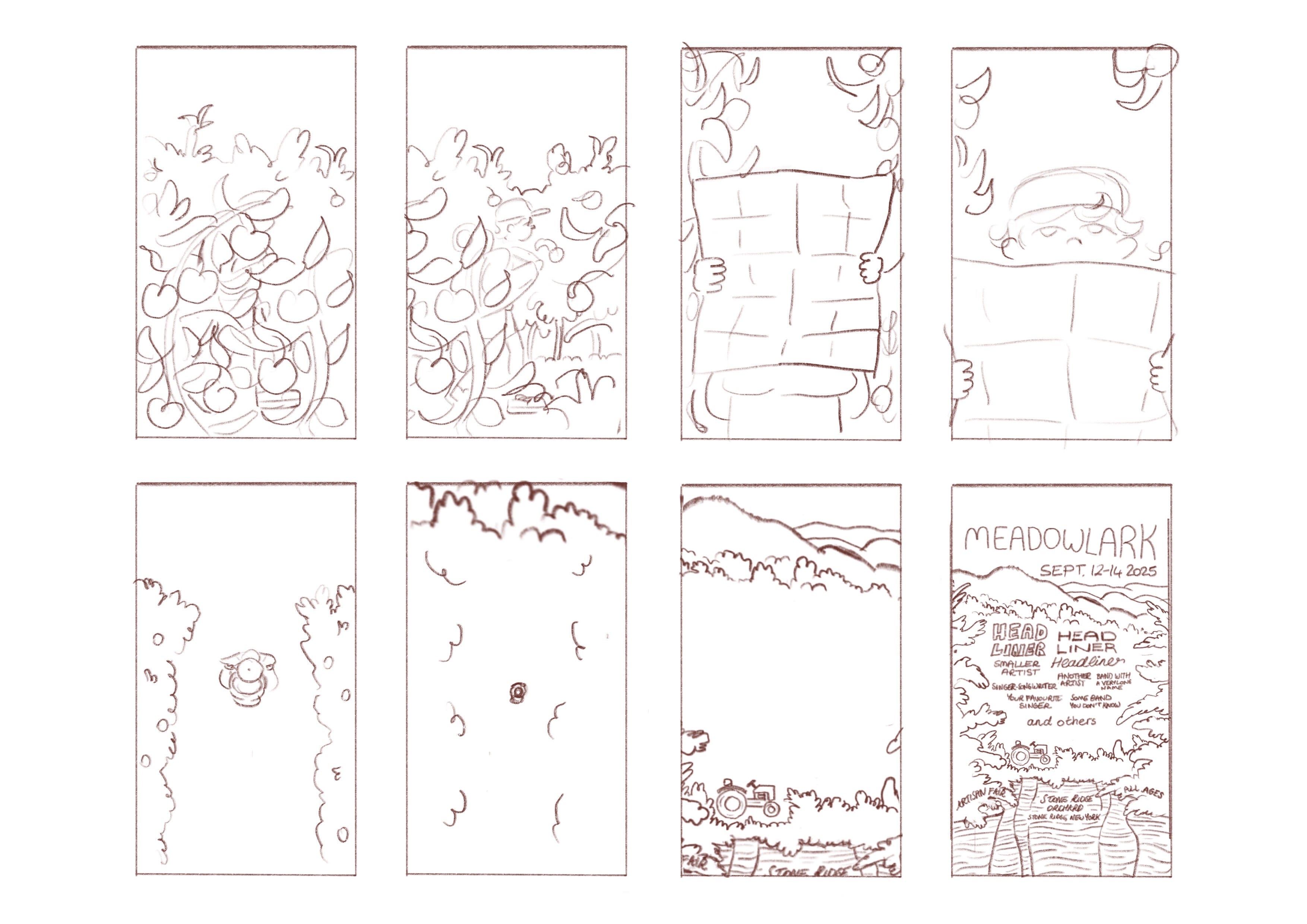
While I was sketching, I had a new idea: I thought it could be cool if the animation transitions into the poster. So I came up with three animation concepts:
Feedback and changes
The client liked the first concept for the animation and the third one for the poster the most—a festival-goer walking through an orchard and the poster with the landscape—and asked if we could combine the two. But first, the poster needed to be tweaked to better reflect the geography of the venue.
With little help from the client and Google Maps, I came up with two new options:
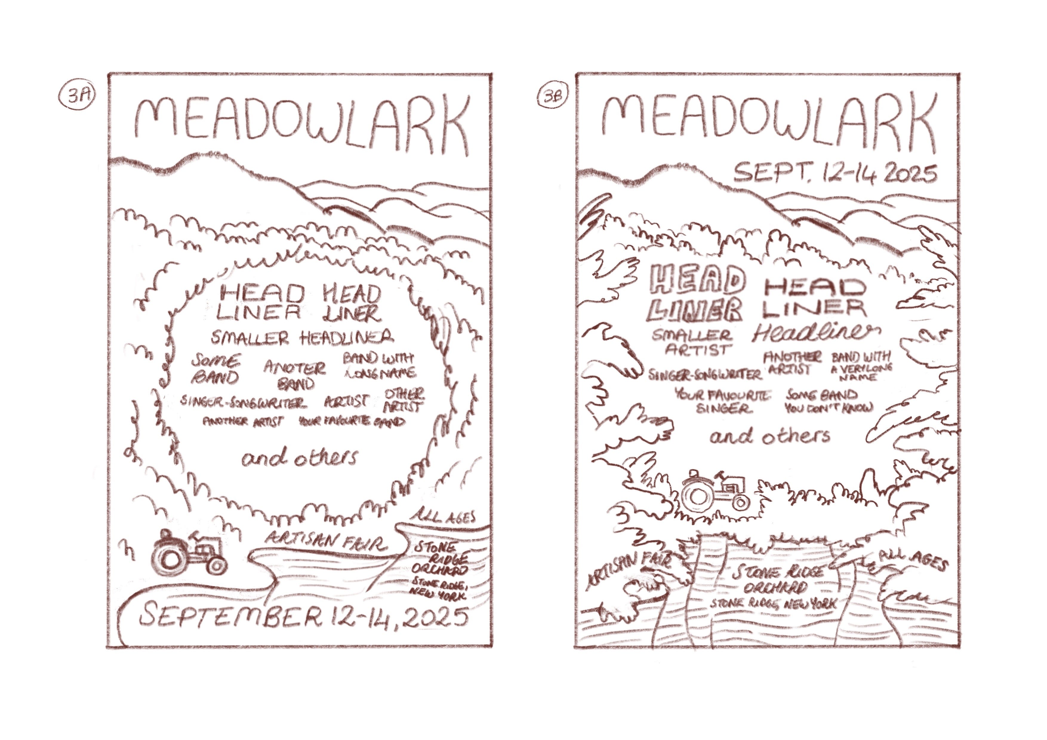


They preferred option 3B, which also happed to be my favourite, so I made new animation storyboards to go with that poster:
Influences
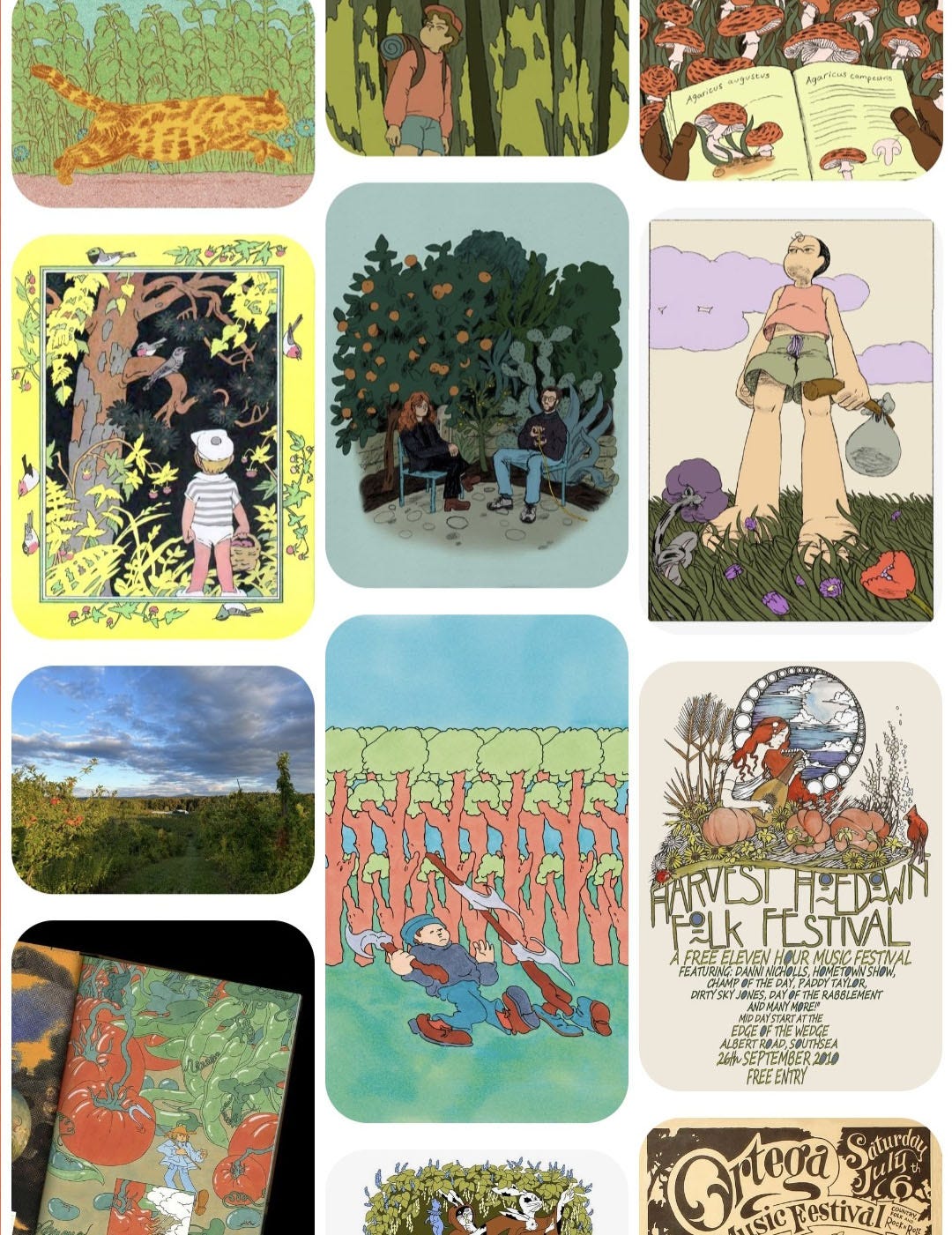
When working on something I’m new to—in this case a poster design—I like to create Pinterest board with both works of other artists and some of my own. I think it’s important not to lose track of your own voice while taking influence from others.
P.S. If you’re reading this in your email inbox, the post might cut off around this point. But don’t worry, you can continue reading it online!
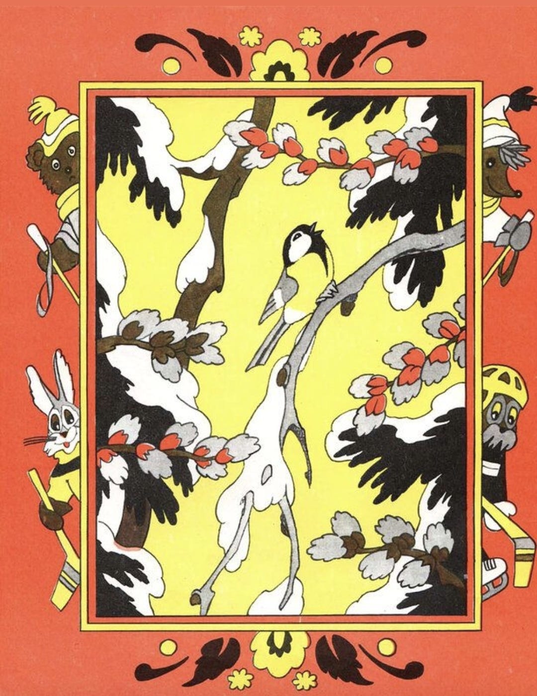
I was heavily inspired by the children’s book illustrations of Erik Bulatov & Oleg Vassiliev for this design. I liked the way they used the negative space of leaves to frame their illustrations and I decided to do something similar for the poster and animation backgrounds.
Making the animation
Keep reading with a 7-day free trial
Subscribe to Human Nature to keep reading this post and get 7 days of free access to the full post archives.